Design Campaign Case Study · Founder’s Office
Selling trust before the first plot is sold.
Full-stack brand & campaign design for a new real-estate land launch on North Bengaluru’s NH44 corridor — a zero-equity entrant up against established, design-forward rivals. Sole designer, end to end: physical, digital and experiential.
The North Bengaluru real-estate corridor along NH44 was an established and competitive market. Our most immediate competitor, Oyster, operated right outside our project’s front door — an established, design-forward brand that had been in the market significantly longer than us.
› Core constraints
No one in the market knew who we were. Consumer skepticism towards a new, unrecognised developer was a real risk.
We could not match the marketing spend of Category-A developers like Prestige, Concord or Lodha. Premium production value had to be achieved through design thinking, not deep pockets.
Our strategy was primarily offline and sales-led. Every physical and digital touchpoint had to perform at a high level — it was doing the heavy lifting for brand trust and lead conversion.
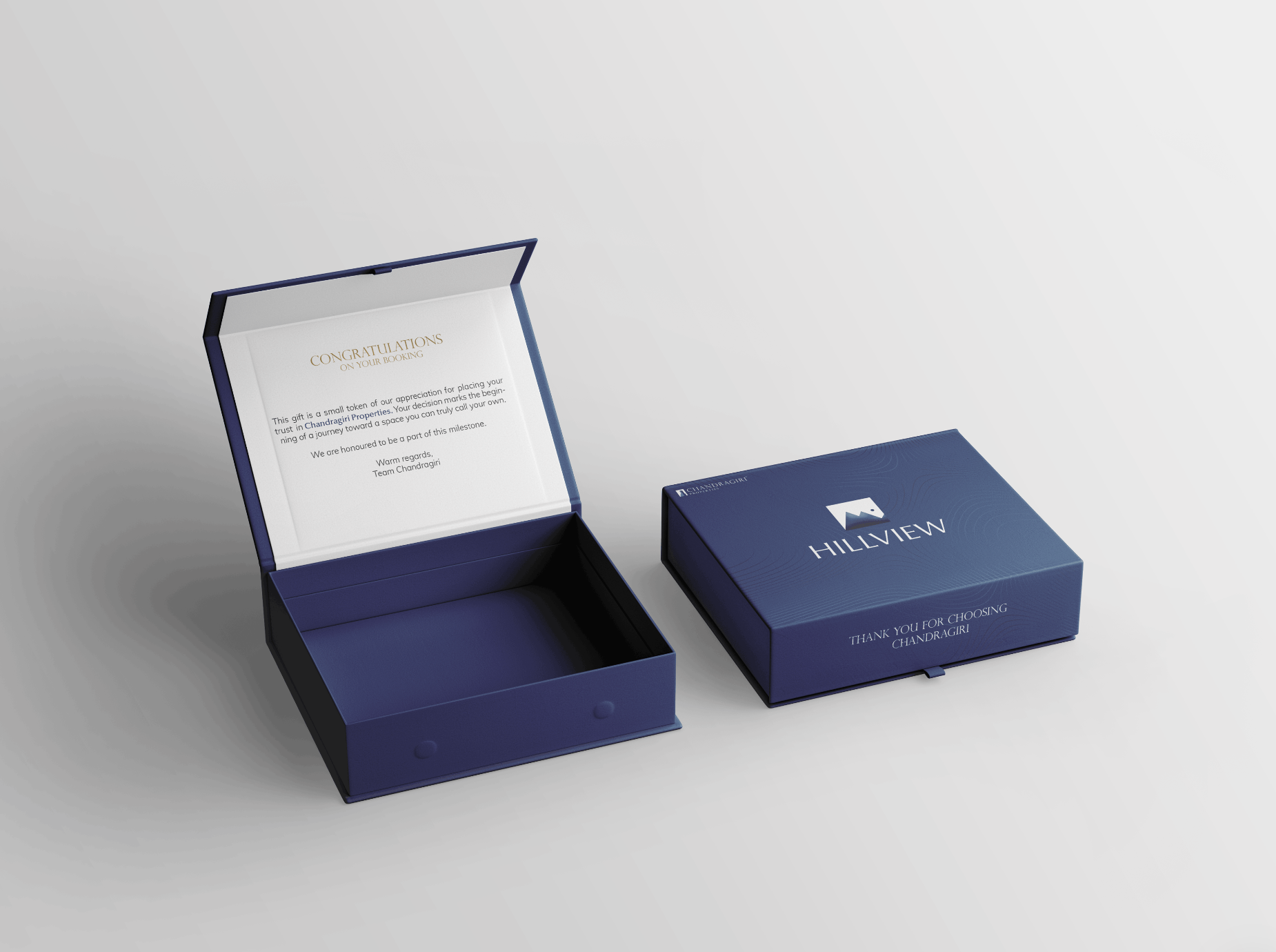
In real estate, especially for a new entrant, consumer trust is the single most important design goal. Everything — from a direction board on a highway to the texture of a gift box — was designed to answer one question: “Can I trust this brand with a major investment?”
› Three pillars of the campaign
Establish legitimacy through RERA registration and formal credentials, upfront.
Visual design that punches above our budget class — cohesive, polished, distinctive.
Communicate scarcity and exclusivity at every touchpoint to accelerate booking decisions.
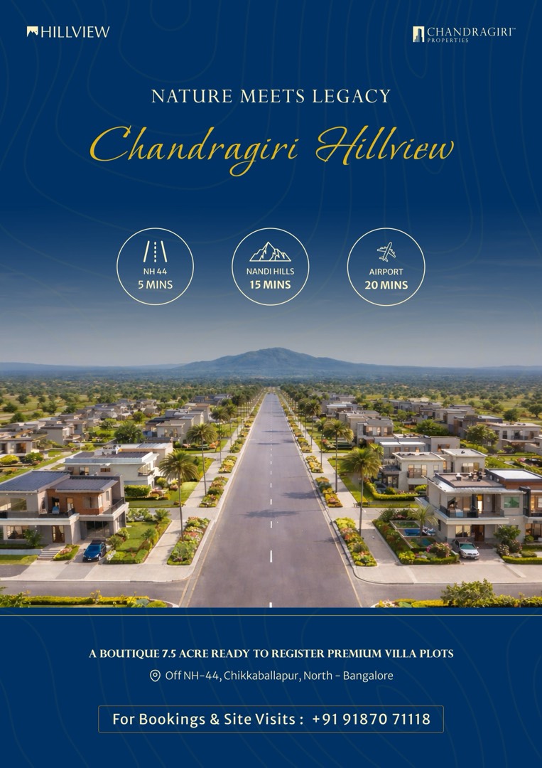
The first and most critical trust-building action was obtaining and prominently displaying our RERA (Real Estate Regulatory Authority) registration number across all collateral. For a new entrant, RERA registration was not just a legal checkbox — it was the most powerful signal of legitimacy we could offer a sceptical consumer.
Design decision: the RERA number was not buried in fine print. It was given visual prominence across the brochure, flyer and digital assets — treated as a trust badge that could be the deciding factor for a hesitant prospect.
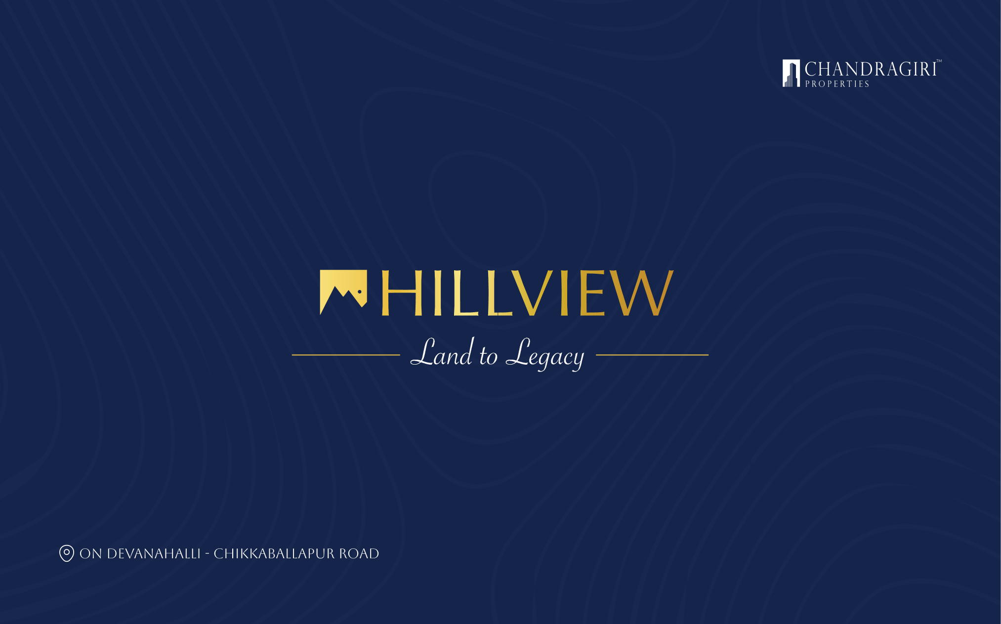
The work below is the project’s real brand system applied across physical and digital touchpoints. (The website and email-newsletter slots remain placeholders — those exports are still in production.)
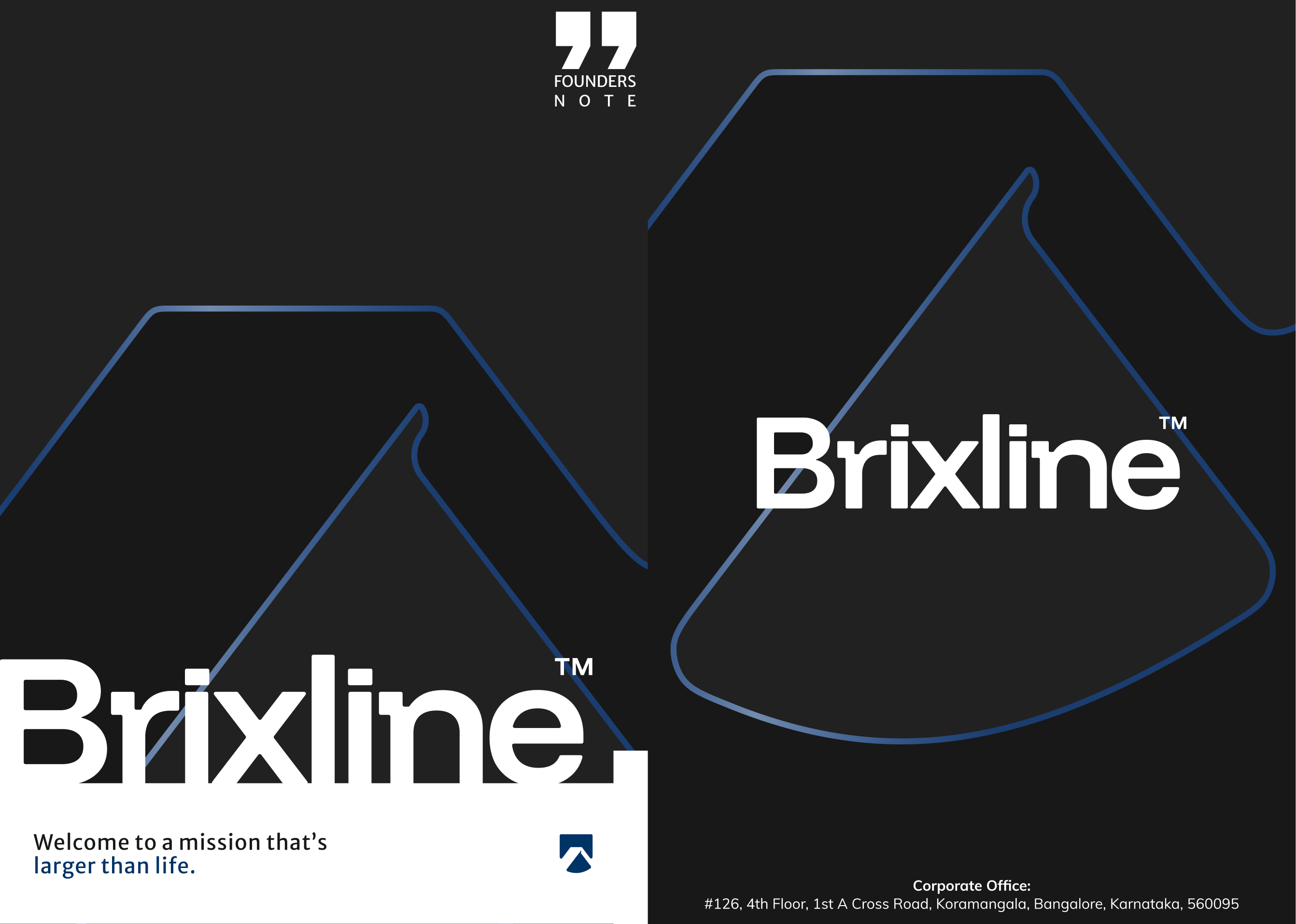
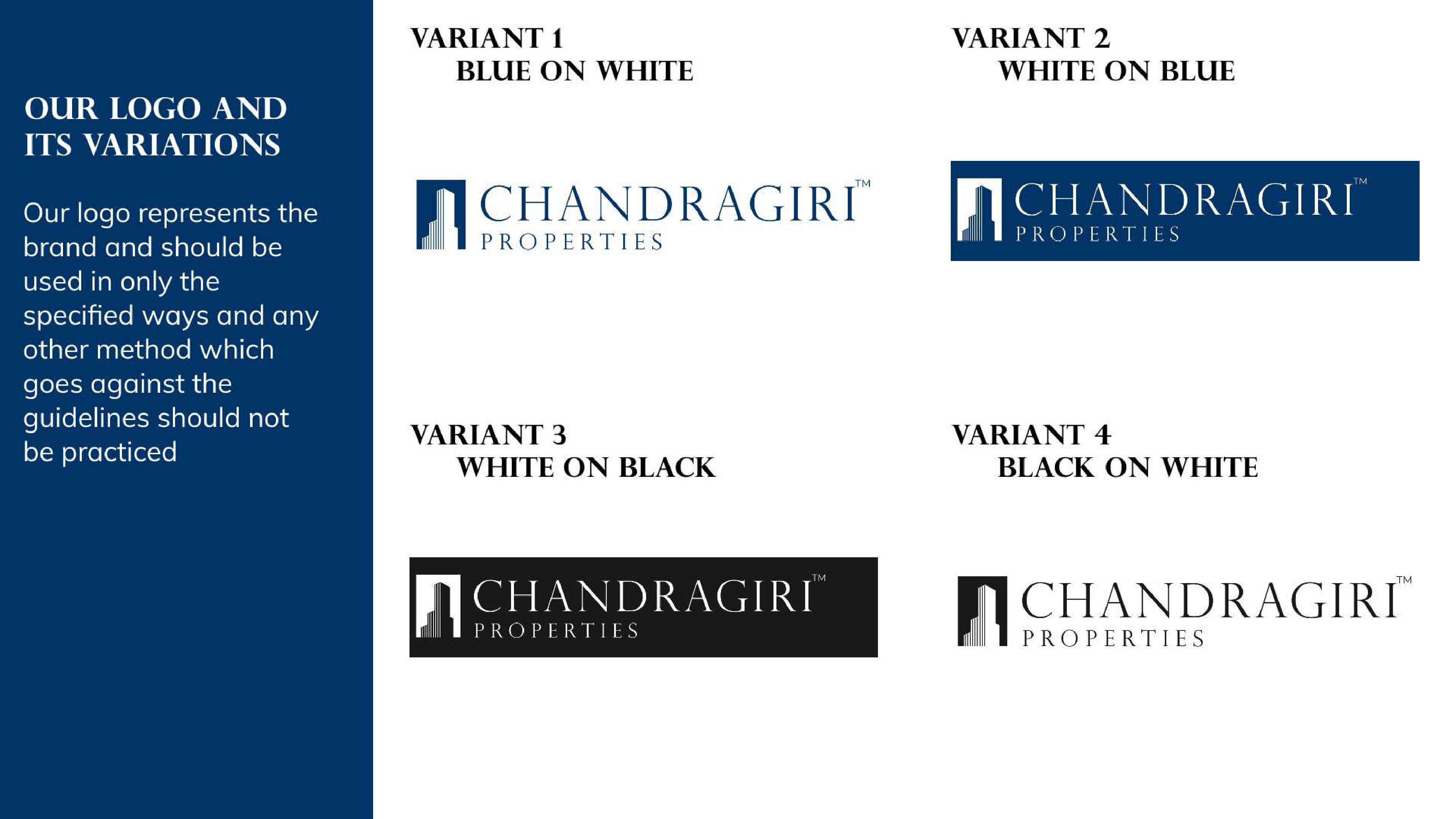
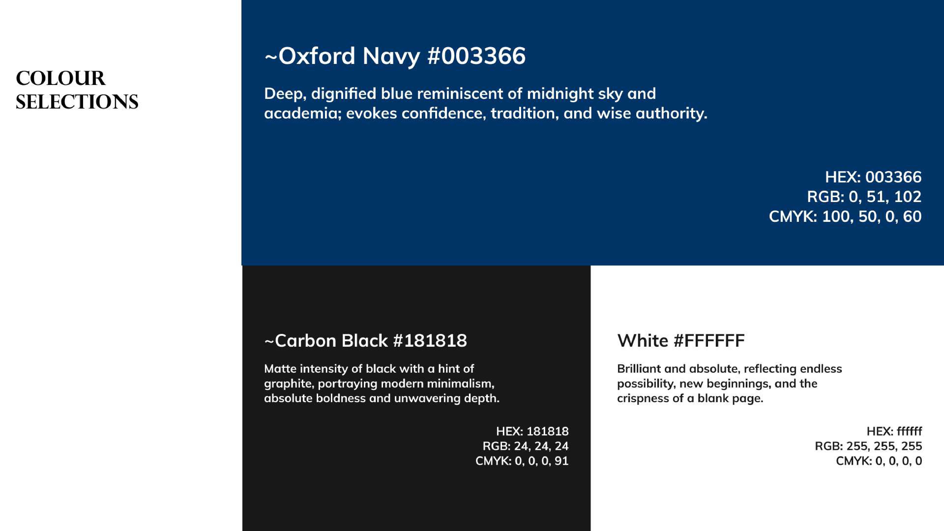
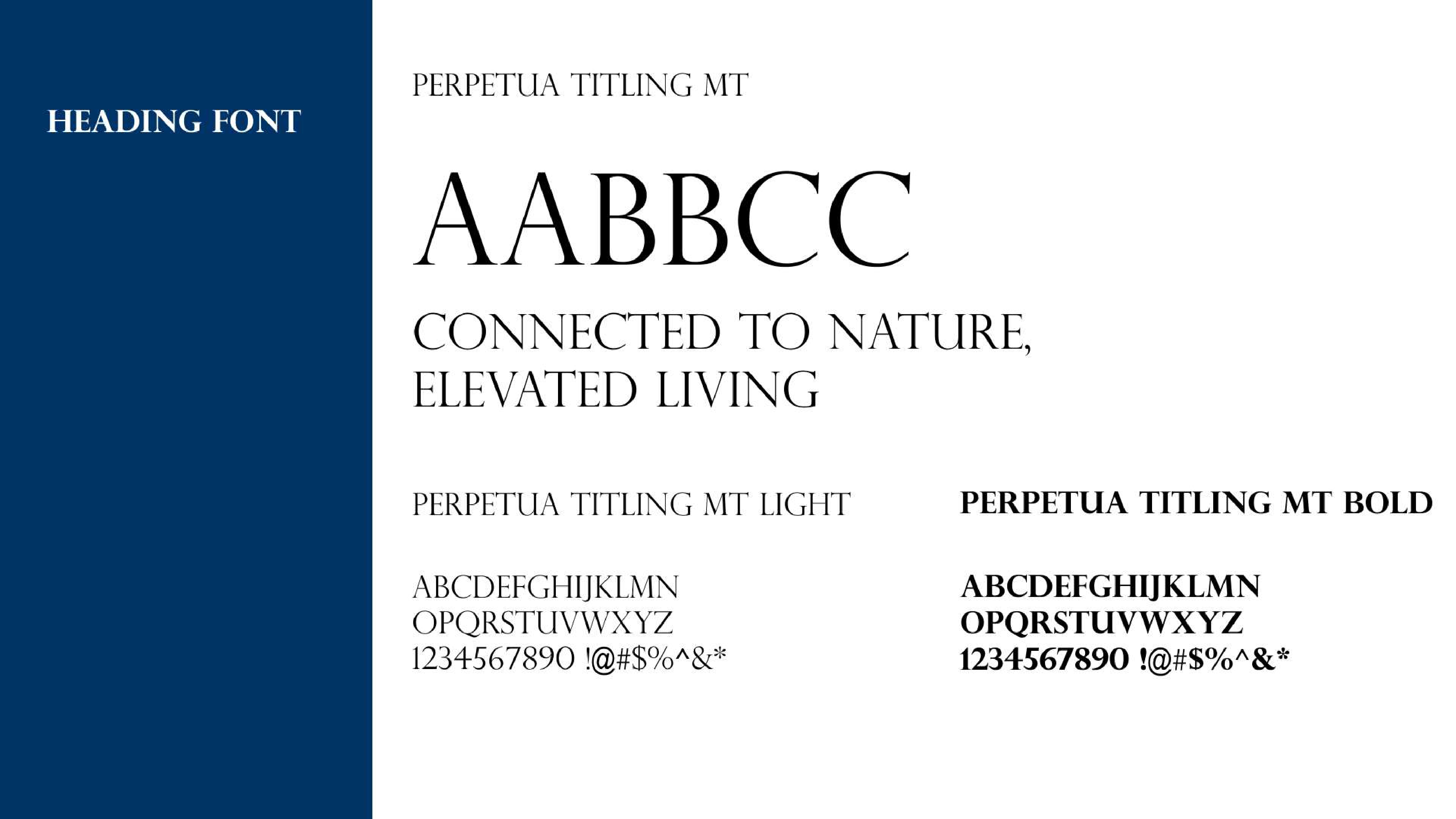
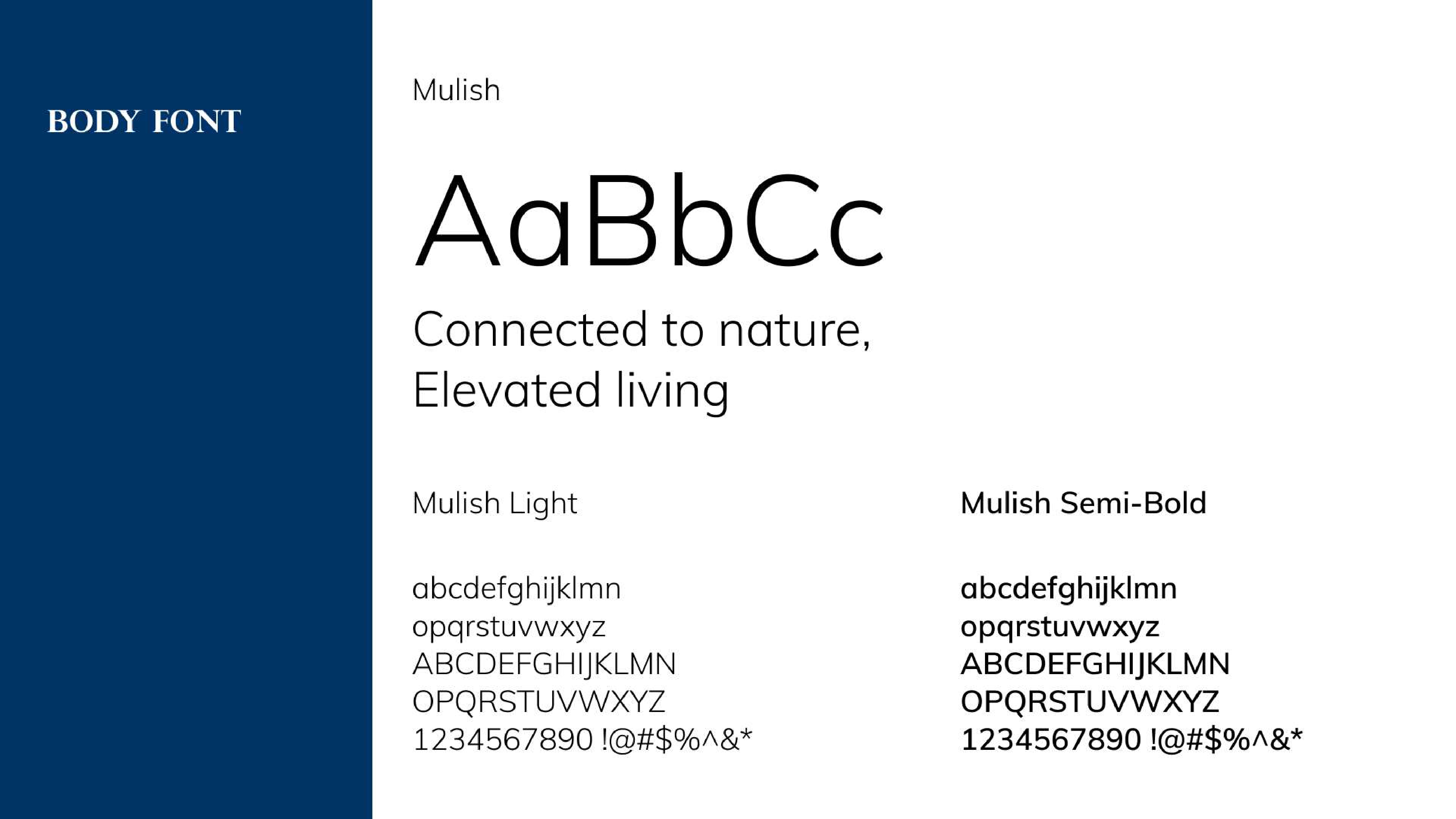
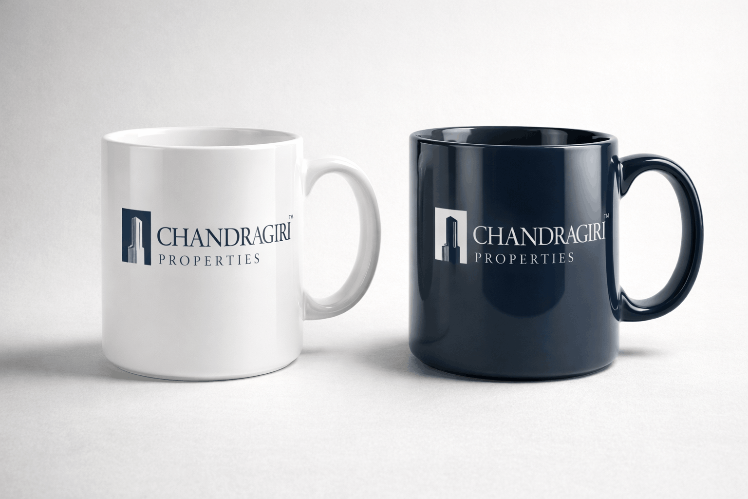
A Brand identity system
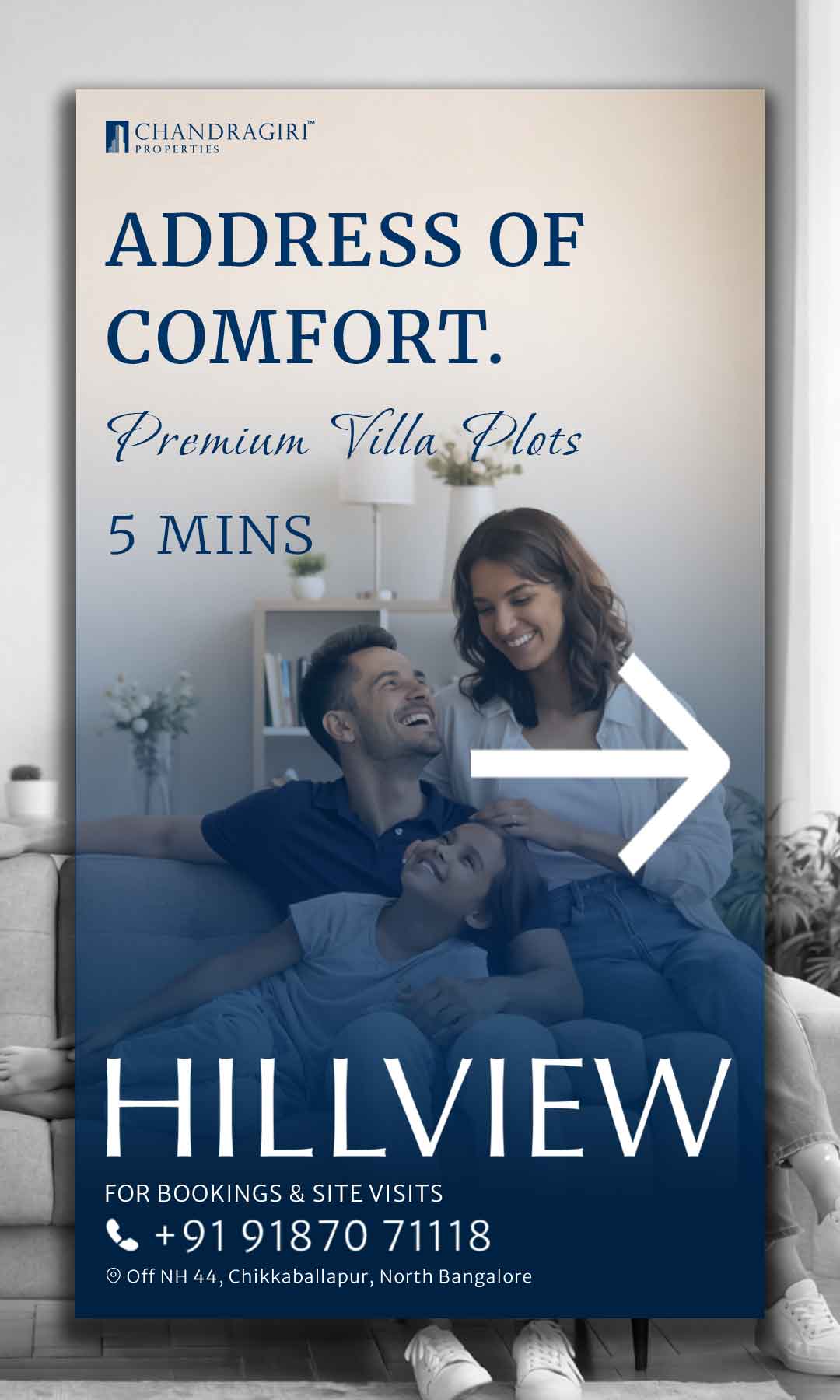
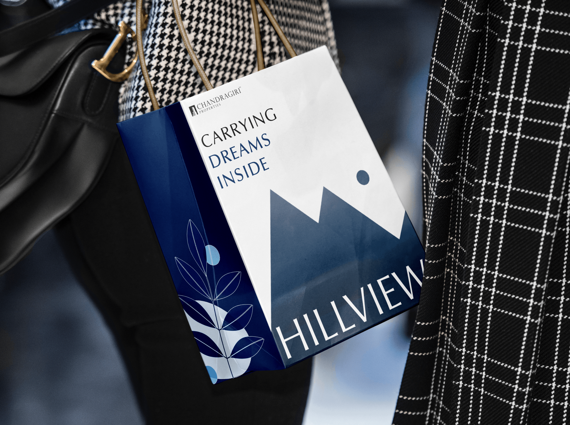
B Physical / offline brand assets
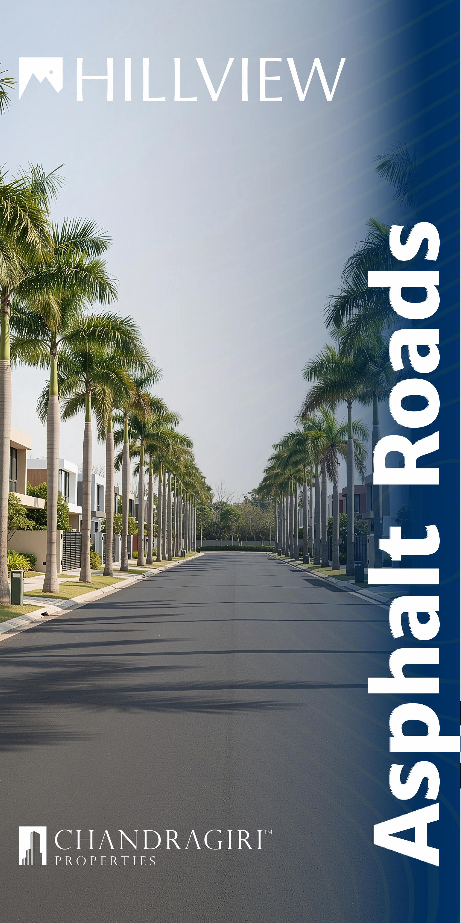
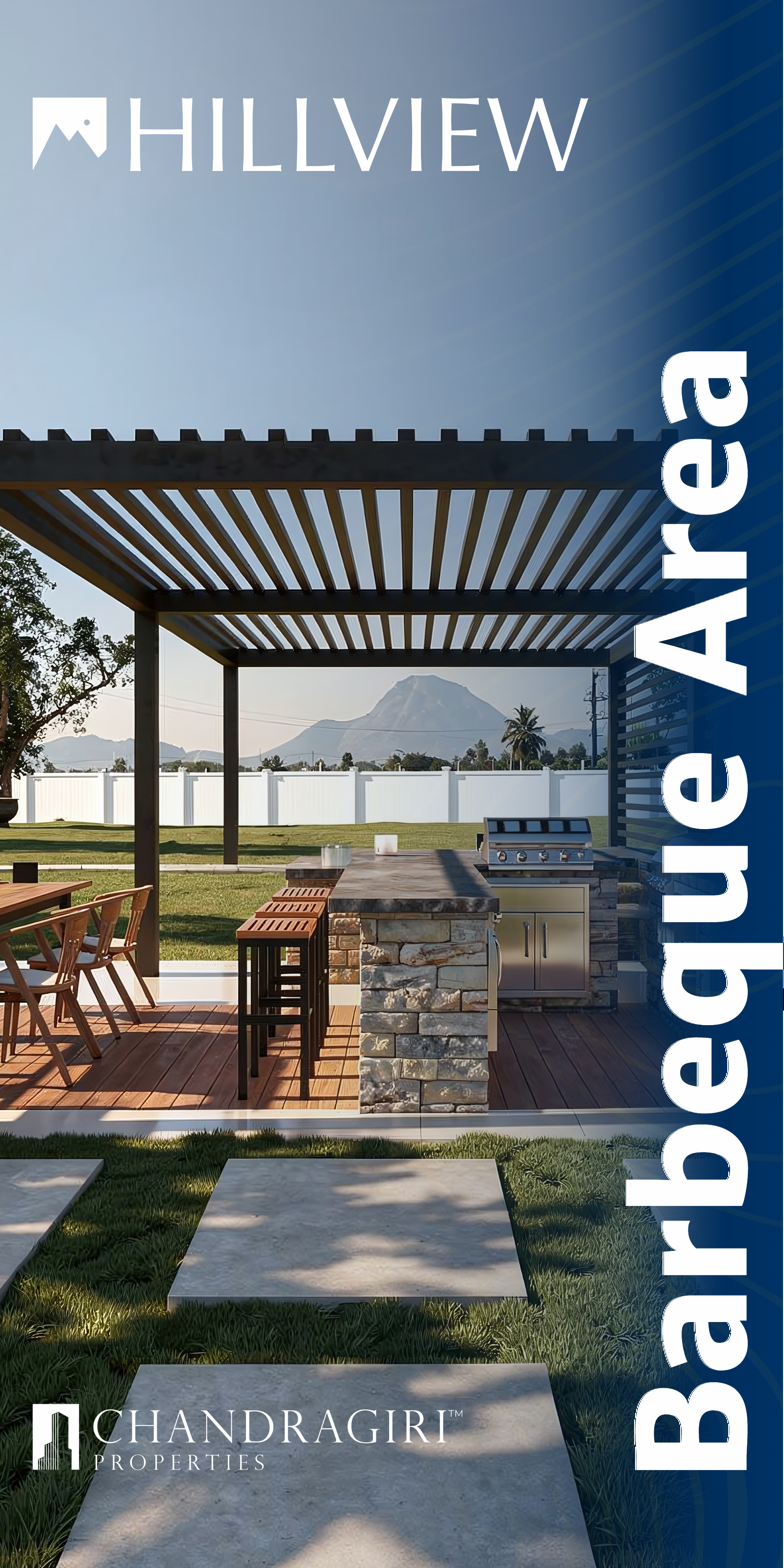
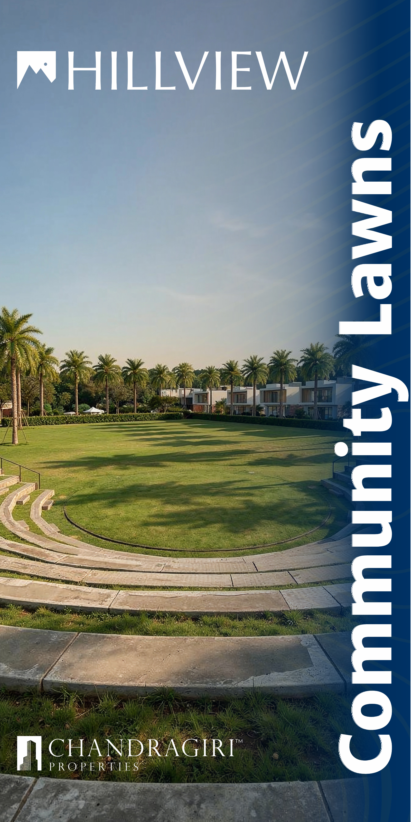
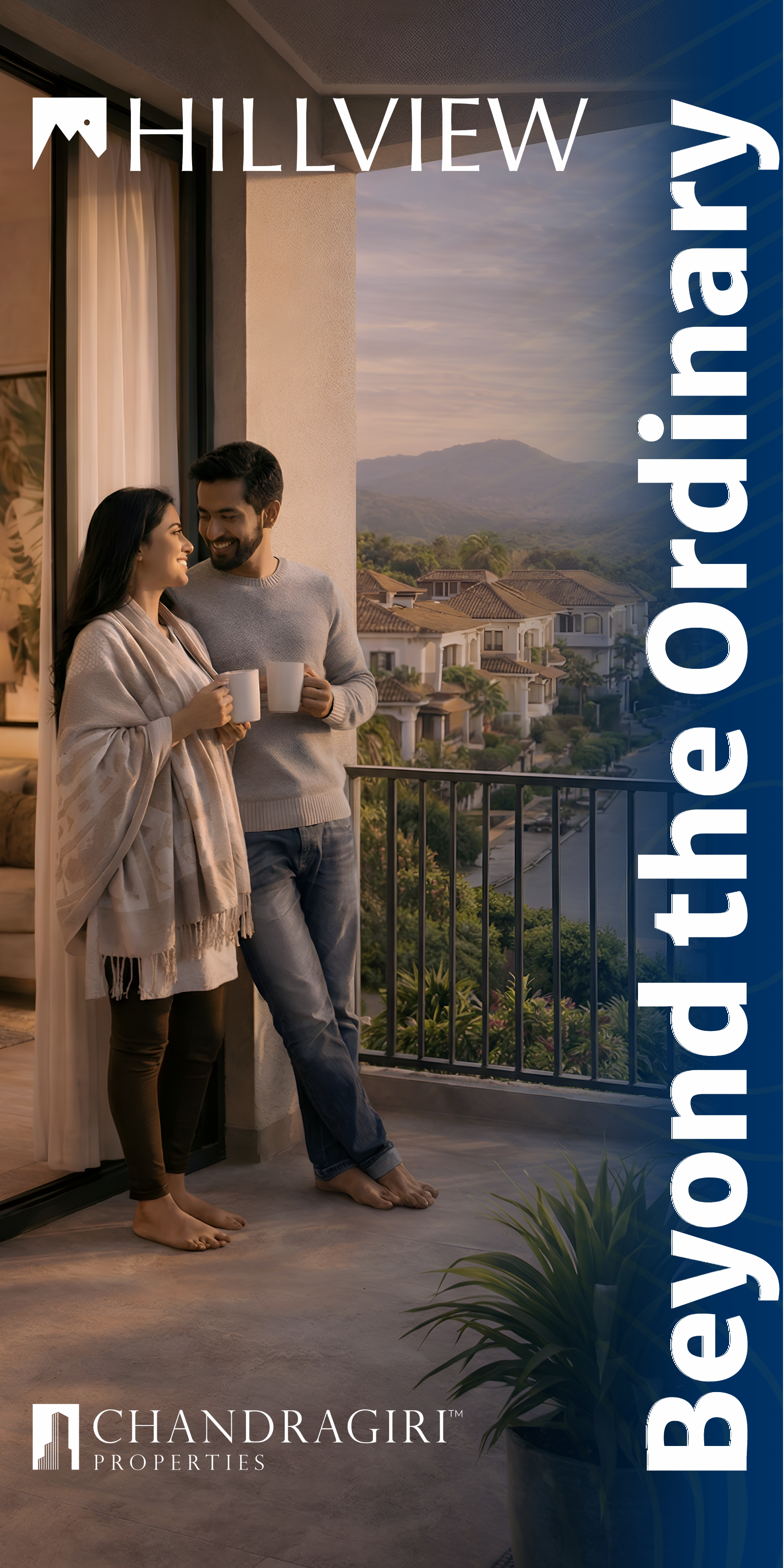
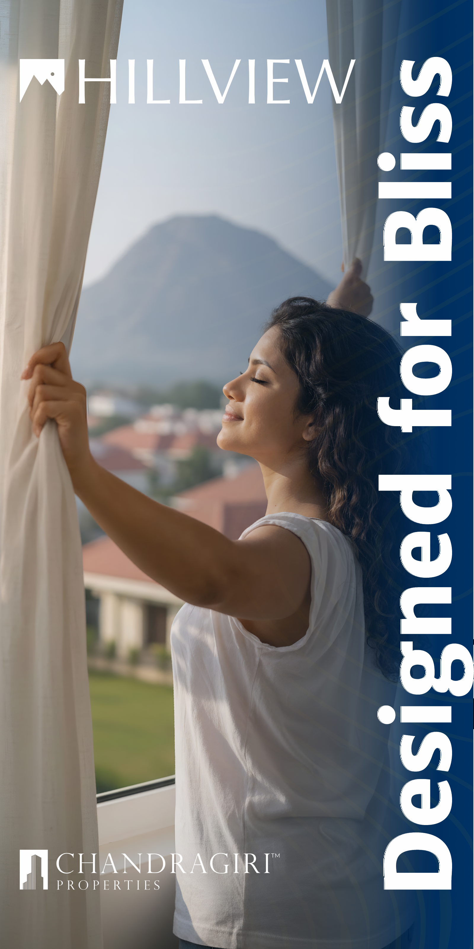
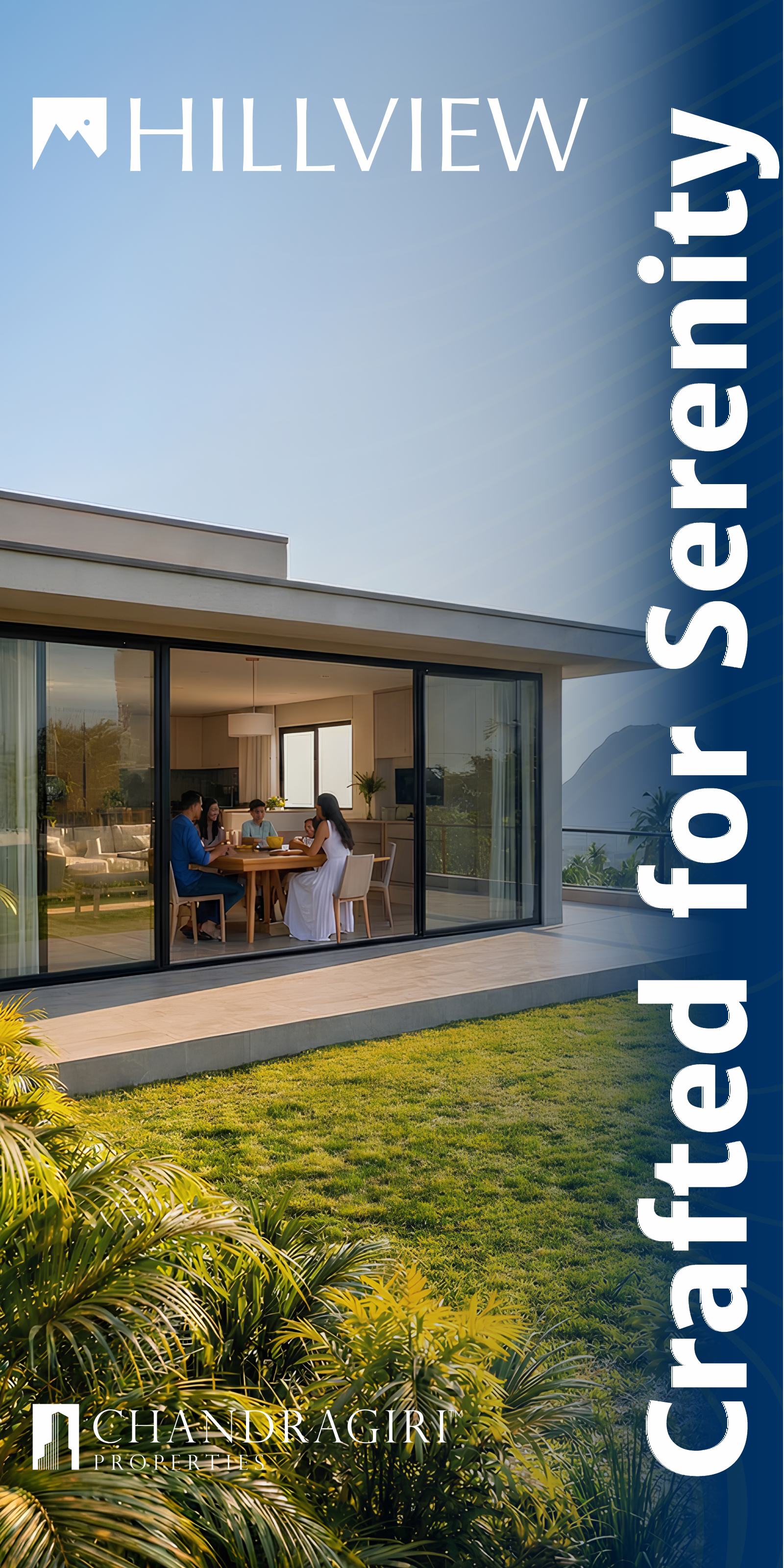
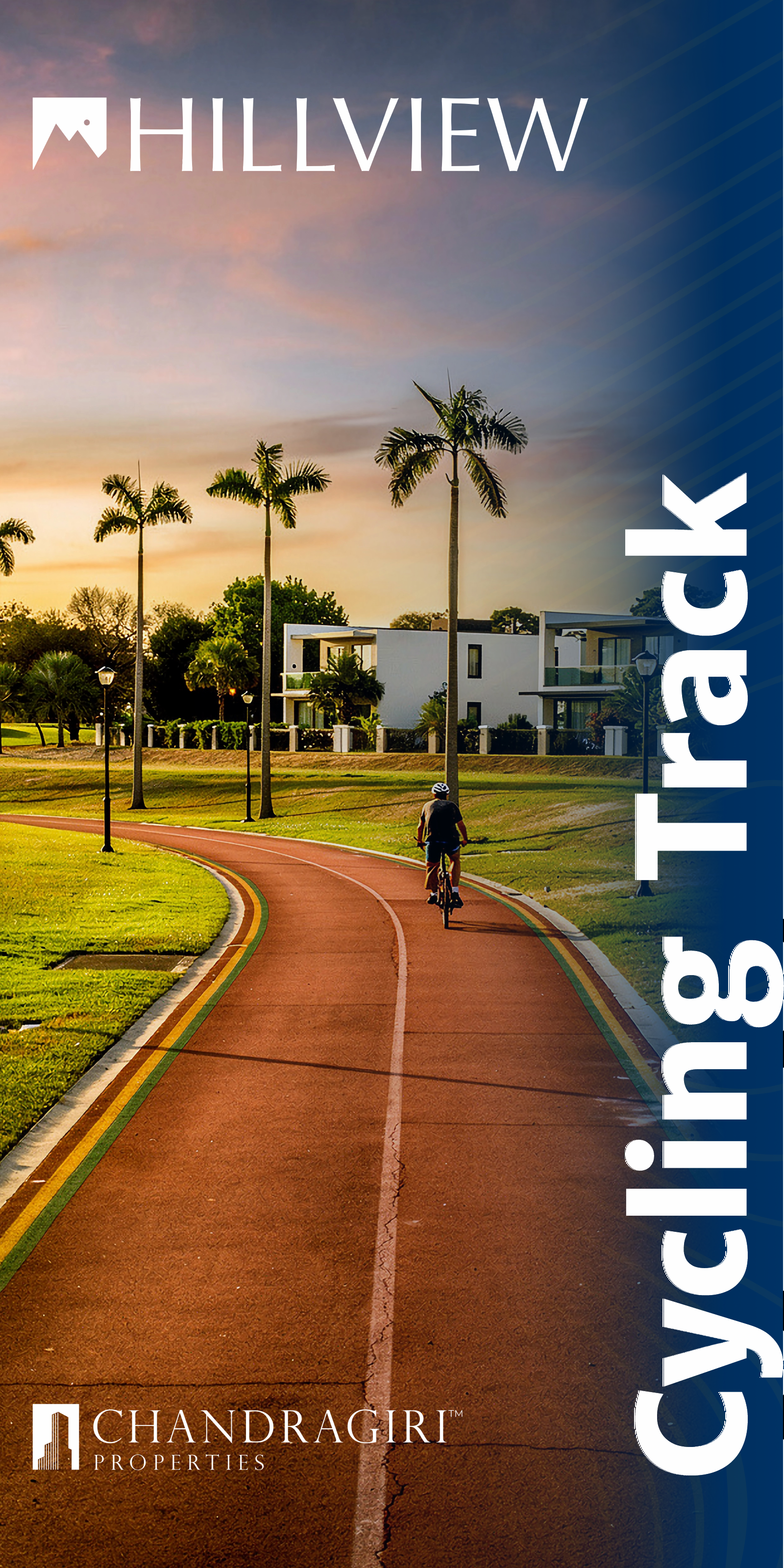
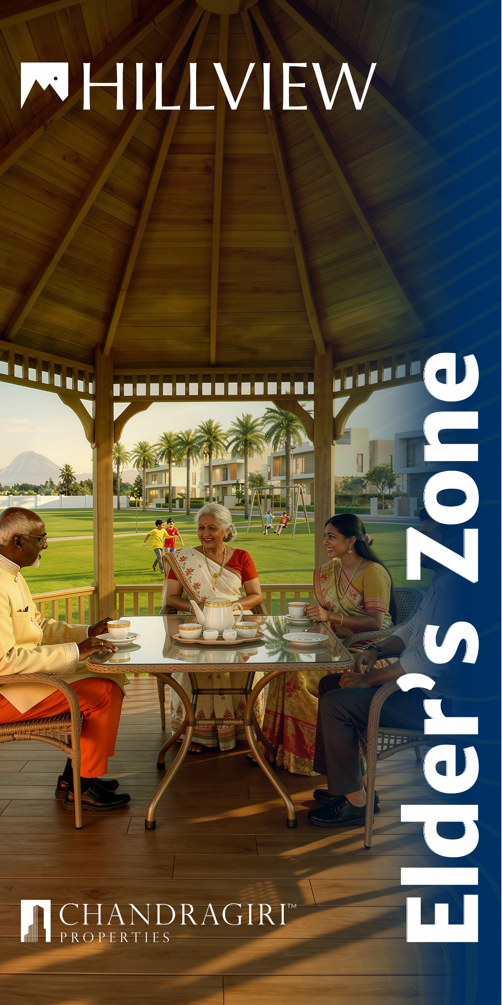
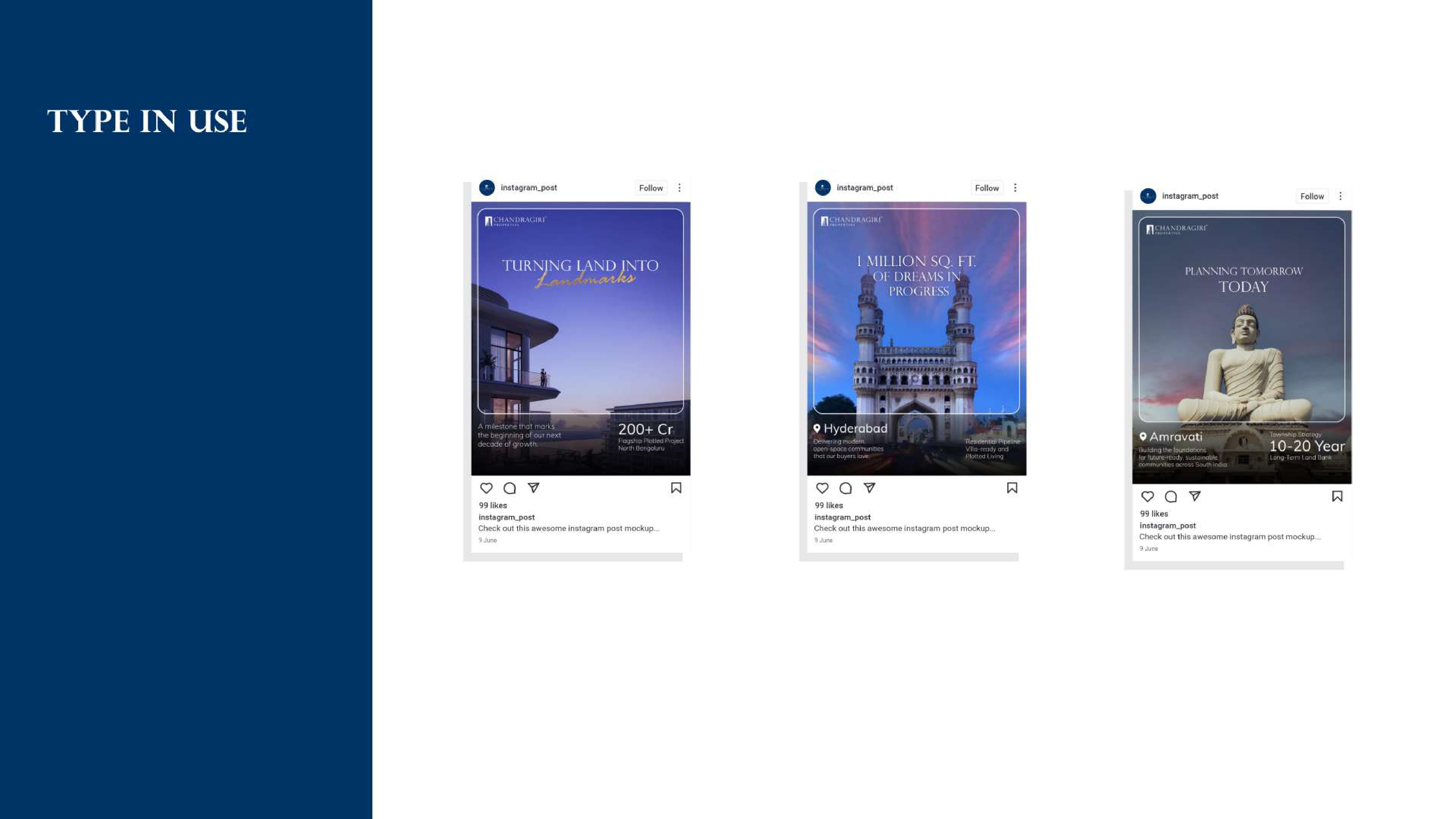
C Digital assets
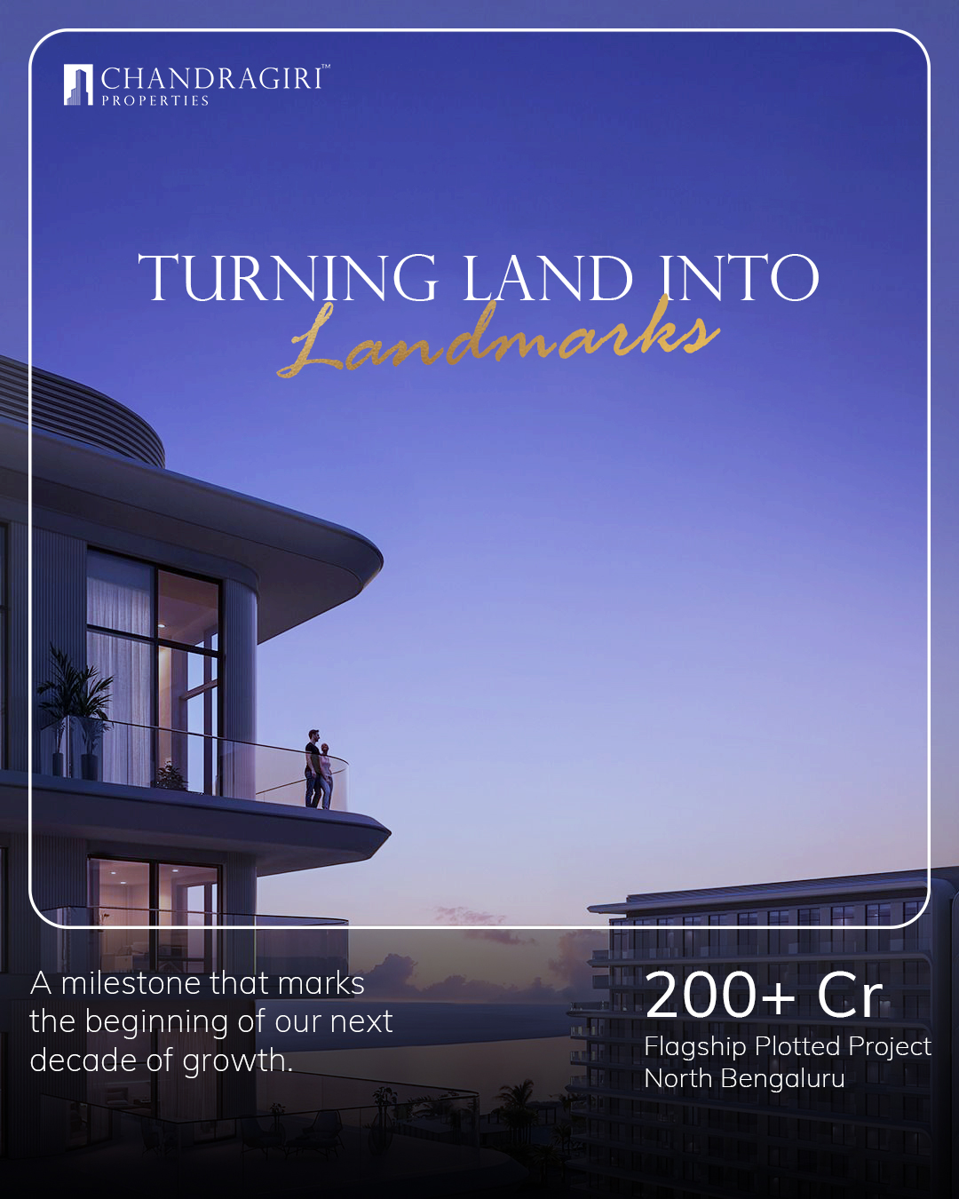
Campaign-aligned, scroll-stopping posts for organic and paid distribution.
The primary digital trust hub — designed to convert curious visitors into site-visit enquiries.
Nurture campaigns for leads captured through site visits and digital enquiries.
A core insight guiding the campaign was that a prospect’s purchase decision is almost never made on-site. The real-estate buying cycle is long — days, sometimes weeks, of deliberation after a visit. Our design needed to keep working after the customer left the property.
↻ The post-visit brand loop
Customer attends a site visit → receives the brochure, flyer and gift kit in a branded paper bag.
They leave the site — but carry our brand home with them, physically.
Every time they pick up the brochure, open the gift box, or see our social post, they re-experience the brand.
The tactile, premium quality of the physical materials reinforces that this developer is serious and trustworthy.
They return to book — or they refer someone who will.
Every physical material was designed so that looking at it, touching it, or showing it to a family member would reproduce the same feeling of exclusivity and confidence that the site visit was meant to create.
Our three direct competitors — Oyster, Codename Tequila and Concord Hillcrest — all had the same category of assets: brochures, flags, direction boards, social media. Category parity was high, so our differentiation strategy was not about doing different things, but doing the same things better.
Informative but generic; visually similar to each other.
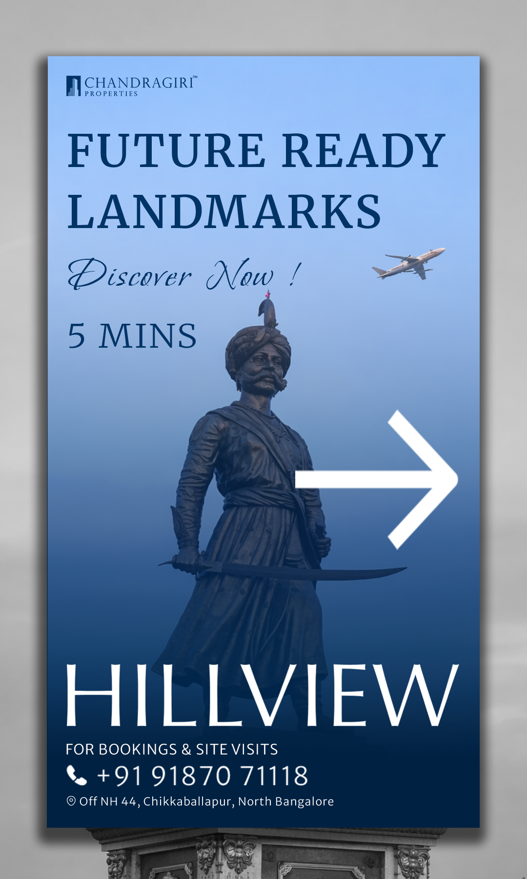
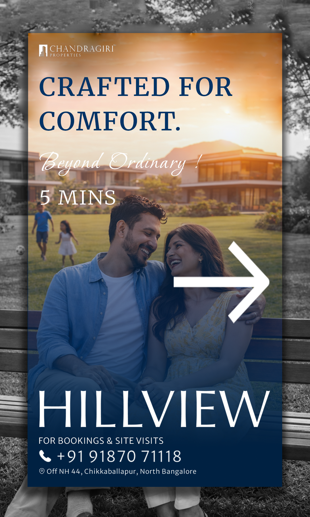
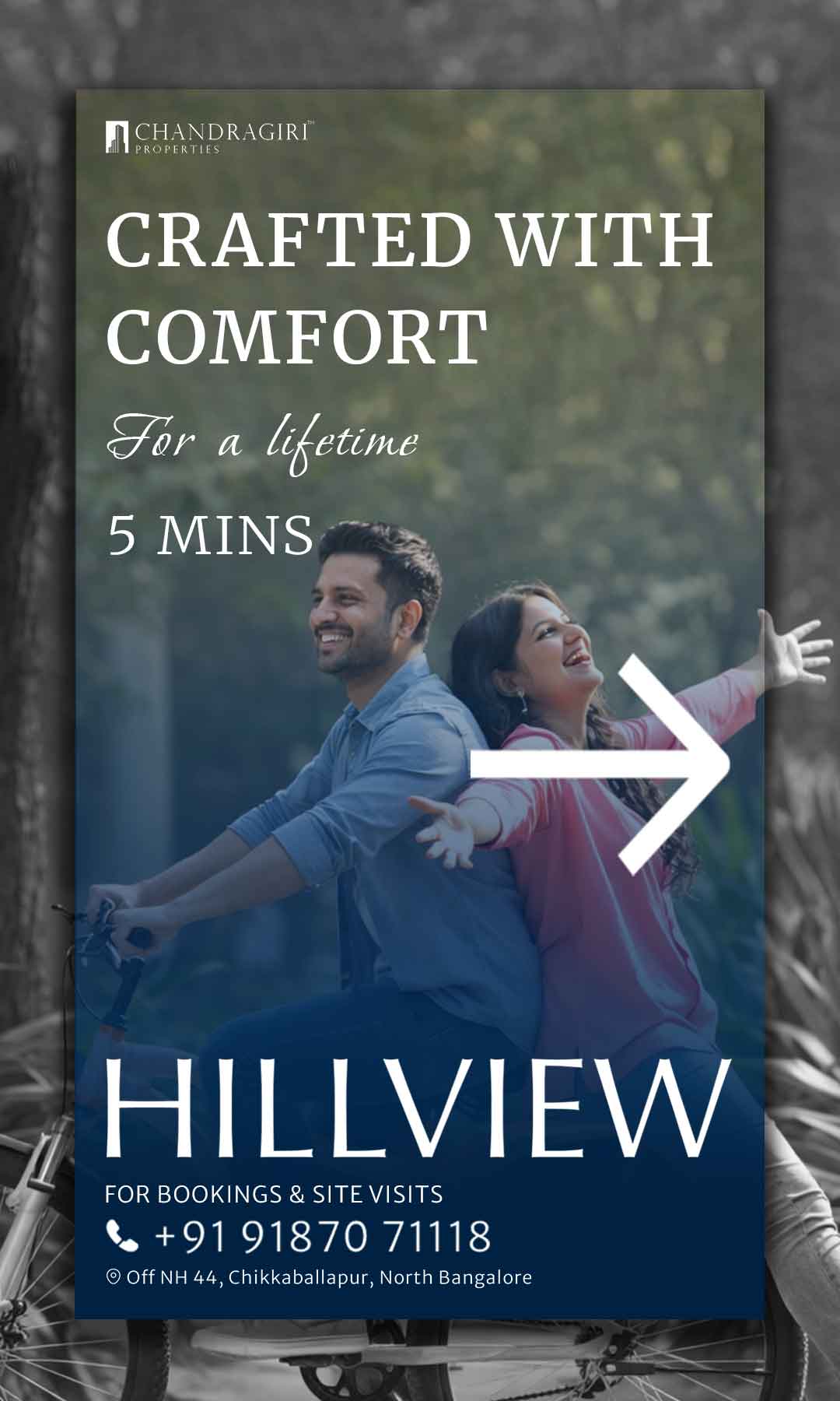
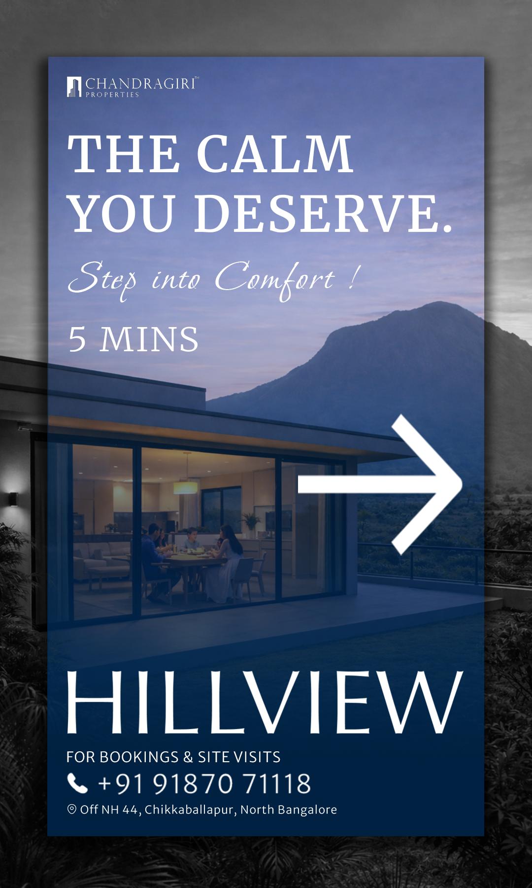
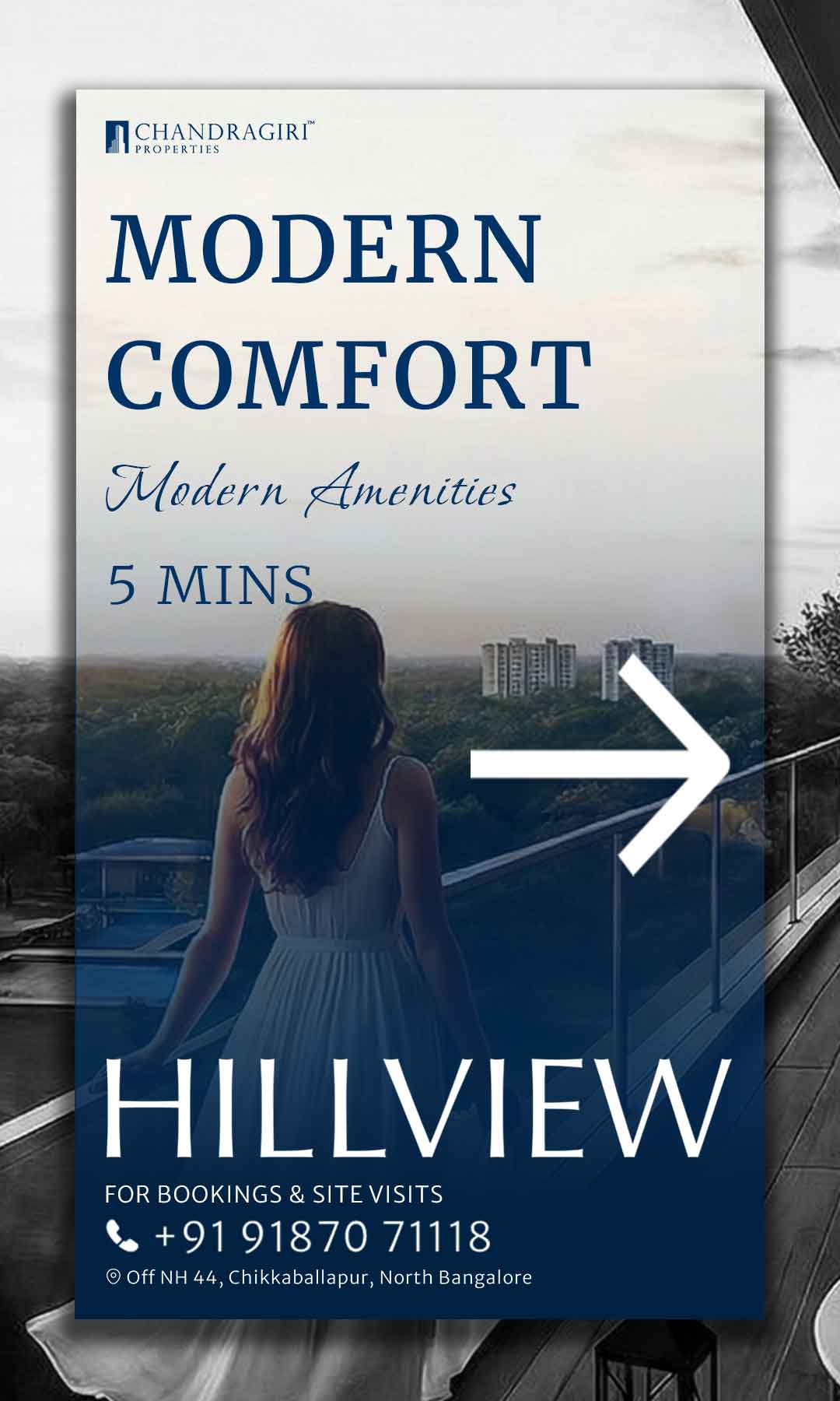
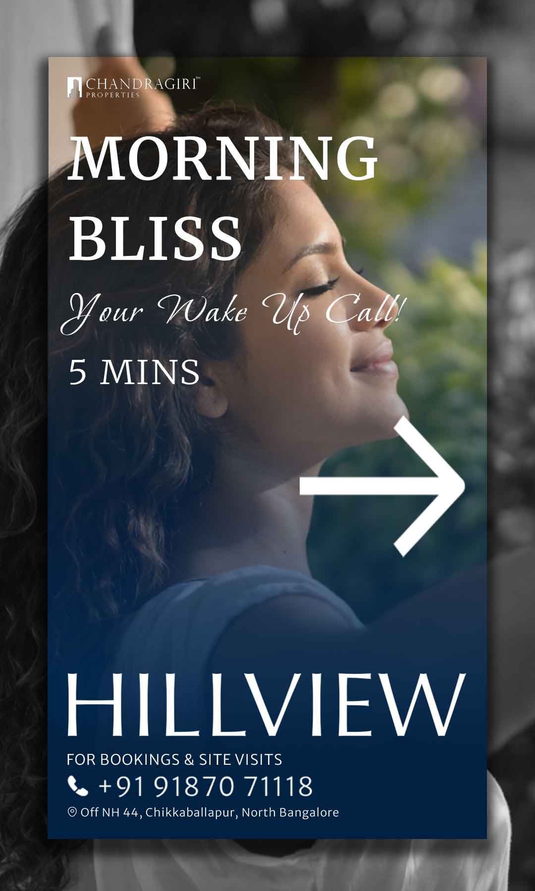
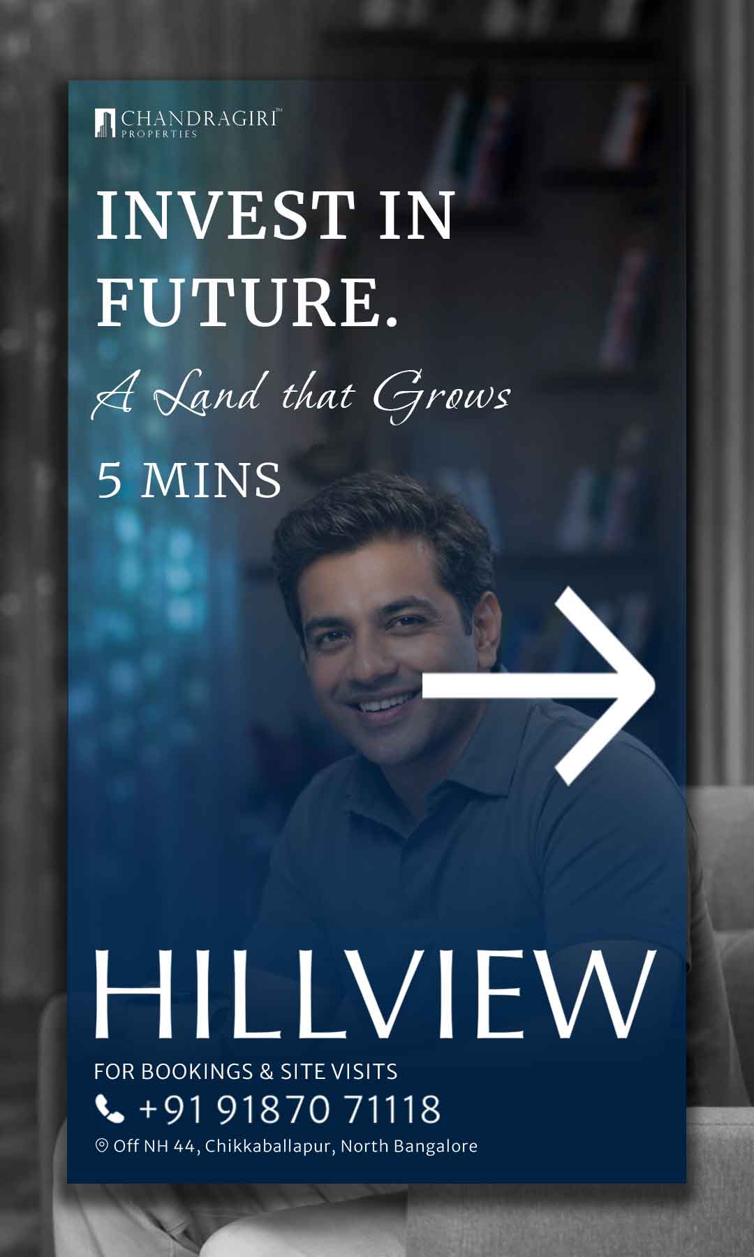
Visually distinctive, high-contrast — easy to spot at highway speeds.
Standard real-estate format; functional.
Premium print feel; layout designed to build desire, not just inform.
Either absent or generic corporate gifts.
Differentiated by customer stage (booked vs. unbooked); emotionally resonant.
Assets designed individually, inconsistent visual identity.
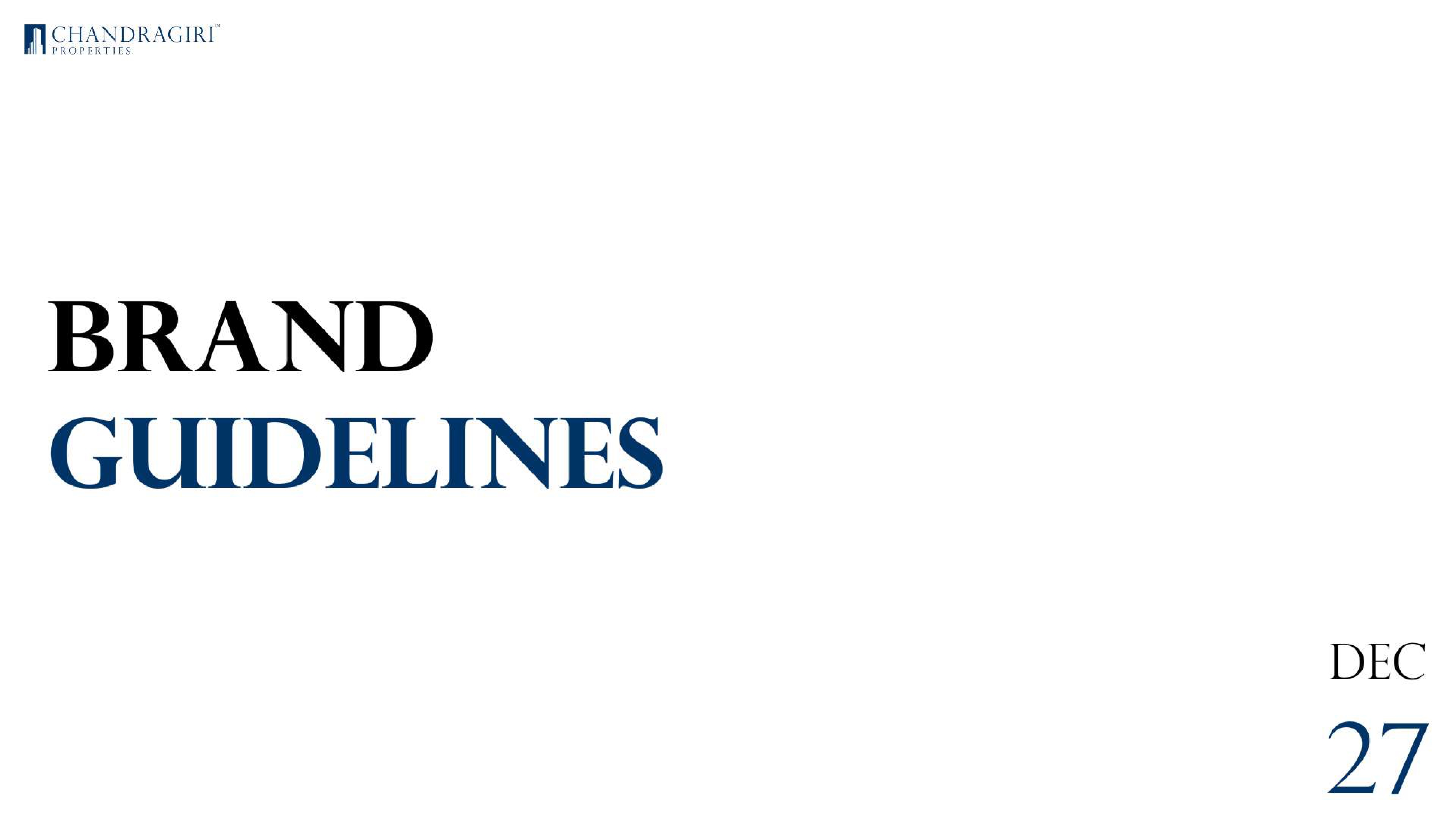
Strict brand guidelines followed across every single touchpoint.
Informational, transactional.
Aspirational and exclusive; FOMO-forward messaging.
Rather than producing many creative variants, we invested design effort into making fewer assets feel exceptionally premium. Fewer touchpoints, higher fidelity.
Given budget constraints and the sales-team-led model, we prioritised physical assets over digital advertising. A great brochure in a buyer’s hand outperforms a digital ad that gets scrolled past.
Real-estate marketing commonly over-indexes on specifications and pricing. We layered in aspirational language and design that created emotional resonance — FOMO, exclusivity, pride of ownership.
As the sole designer, I created and enforced brand guidelines to keep every asset consistent — including those produced by vendors for physical production. This prevented quality dilution at the fabrication stage.
All design deliverables directly enabled the sales team’s ability to qualify, nurture and convert leads — embedded in the sales journey at every stage.
Direction boards drove first site discovery from NH44 highway traffic.
The entrance arch and on-site flags created an immediate premium brand impression on arrival.
The brochure and flyer gave the sales team credible, high-quality leave-behinds to extend conversations post-visit.
Gift kits split by customer stage (booked vs. unbooked) gave the sales team a tool to reinforce relationships at different points in the funnel.
Social media and the email newsletter kept the brand present in a prospect’s mind through the deliberation period.
RERA prominence across all assets proactively addressed credibility objections before they were raised.
In real estate, trust is the product.Design must prioritise signals of credibility over aesthetics.
Brand cohesion is a force multiplier.For a new entrant with a constrained budget, it makes a small team look like a much larger, more established organisation.
Physical can outperform digital.In high-consideration, high-value categories, a well-designed brochure is a sales tool that works 24/7 without an ad budget.
FOMO has to be earned.It’s a legitimate, powerful mechanism in real estate — but only if the underlying design quality earns the right to make the claim. The design has to feel as premium as the scarcity implies.
One designer, full context.Being the sole designer across all touchpoints is a real advantage for cohesion — every decision is made with the whole brand in view, not in isolation.